| Porting my blog for the second time, layout part 3 |
Porting my blog for the second time, render posts |
Porting my blog for the second time, layout part 4
This is post #22 of my series about how I port this blog from Blogengine.NET 2.5 ASPX on a Windows Server 2003 to a Linux Ubuntu server, Apache2, MySQL and PHP. A so called LAMP. The introduction to this project can be found in this blog post /post/Porting-my-blog-for-the-second-time-Project-can-start.
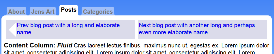
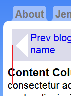
Now I will create something making it possible to go to the previous and next blog post. Like this:
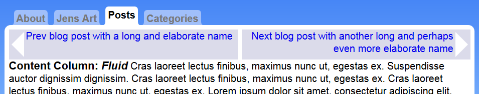
For this purpose I created another unordered list at the top of the contentwrapper section. Like this:
≺ul class = "nav"≻≺li≻≺a href = "/"≻Prev blog post with a long and≺br /≻elaborate name≺/a≻≺/li≻≺li≻≺a href = "/"≻Next blog post with≺br /≻another long and perhaps even more elaborate name≺/a≻≺/li≻≺/ul≻
And then I started model this construction until I had two rectangles next to each other with arrows in them. The only problem was the width. I wanted the two items to share exactly 50% of the space of the contentwrapper but if they came to close each other they would not fit and the right would come below the left and other ugly odd things. No matter what I did the result would be that when navigating with this the rectangles would jump around when going from page to page. For every page a new situation and it would be really ugly.
So I started thinking: what do we have for dividing a space in half that simply works flawlessly? A table!
≺table class = "nav"≻≺br /≻ ≺tr≻≺br /≻ ≺td≻≺a href = "/"≻Prev blog post with a long and elaborate name≺/a≻≺/td≻≺br /≻ ≺td≻≺a href = "/"≻Next blog post with another long and perhaps even more elaborate name≺/a≻≺/td≻≺br /≻ ≺/tr≻≺br /≻≺/table≻
First of all I wanted some space between the cells. Created that with the border-spacing. Then I set the background and aligned the content of the cells to the top of the cells. Indeed I gave each cell a width of 50%. Added some padding of 3px to the cells so the content would come off the edge of the cells. Finally I removed the default underline under hyperlinks. The styles of all this so far:
.nav≺br /≻{≺br /≻ border-spacing:7px;≺br /≻}≺br /≻≺br /≻.nav td≺br /≻{≺br /≻ background: #DBDBEA;≺br /≻ vertical-align:top;≺br /≻ width:50%;≺br /≻ padding:3px;≺br /≻}≺br /≻≺br /≻.nav td a≺br /≻{≺br /≻ text-decoration:none;≺br /≻}
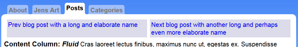
And this is how that looks like:
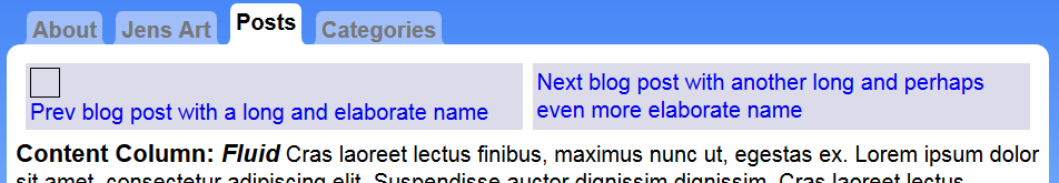
Now I want to create the left arrow and I begin this by adding a pseudo item in front of the link in the left column. Like this:
.nav td:first-child:before≺br /≻{≺br /≻ content:" ";≺br /≻ display:block;≺br /≻ width:20px;≺br /≻ height:20px;≺br /≻ border:1px solid black;≺br /≻}
This just displays a square.
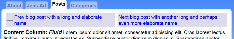
Since I want the square next to the link I need to make the test square to float left and then I need to style the link. I give the link a left margin of 15px and I make it into a block:
.nav td:first-child a≺br /≻{≺br /≻ display:block;≺br /≻ margin:0 0 0 25px;≺br /≻}
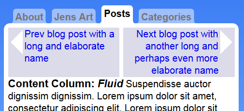
Now it is time for the magic! You probably seen borders of 1px width a lot but what happens when the border is really thick. Like really very thick? When the border is thick one side has a 45 degrees edge to the other sides border of the rectangle. So when we make only one side visible and the other sides transparent and the border really thick then what is left is a triangle. This trick I will use here. I remove the 20 by 20 width and height and the test border and insert new rules so that the before rule list looks like this:
.nav td:first-child:before≺br /≻{≺br /≻ content:" ";≺br /≻ display:block;≺br /≻ float:left;≺br /≻ width: 0px;≺br /≻ height:0px;≺br /≻ border-style: solid;≺br /≻ border-width: 20px 20px 20px 0px;≺br /≻ border-color: transparent #FFFFFF transparent transparent;≺br /≻ margin:3px;≺br /≻}
The border width at the tip of the triangle is 0. All sides are transparent except the back side of the triangle. This is how it looks now:
Now it is time to create a triangle at the next cell of the navigation table. You could think that now it is just a question of mirroring things so that before becomes after etc but that is not the case.
This is what happens when I insert this test rule:
.nav td:last-child:after≺br /≻{≺br /≻ display:block;≺br /≻ float:right;≺br /≻ content : " ";≺br /≻ width:20px;≺br /≻ height:20px;≺br /≻ border:3px dotted yellow;≺br /≻}
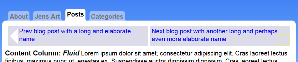
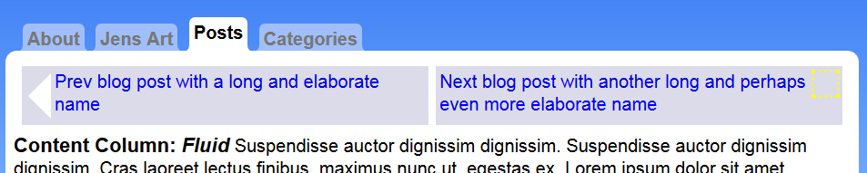
The yellow dotted square comes below the link. That is because the link comes first. If I want the yellow dotted square to come at the same height as the left arrow then the yellow square needs to come first in the cell. So hence it needs to be inserted before the link. Like this:
.nav td:last-child:before≺br /≻{≺br /≻ display:block;≺br /≻ float:right;≺br /≻ content : " ";≺br /≻ width:20px;≺br /≻ height:20px;≺br /≻ border:3px dotted yellow;≺br /≻}
The result is this:
With the text object at the correct place we remove the test rules such a width, height and dotted yellow border. Instead we insert the border magic to change the object into a triangle. This time the tip of the triangle is on the right side of the rectangle so that side has border width 0. The actual triangle is created from the back of the triangle and that is the left side of the rectangle. That side i made white with #FFF and the rest are transparent. The rule list then looks like this:
.nav td:last-child:before≺br /≻{≺br /≻ display:block;≺br /≻ float:right;≺br /≻ content : " ";≺br /≻ width: 0px;≺br /≻ height:0px;≺br /≻ border-style: solid;≺br /≻ border-width: 20px 0 20px 20px;≺br /≻ border-color: transparent transparent transparent #FFF;≺br /≻ margin:3px;≺br /≻}
I want the link to be aligned right. For that modify the rule list of the next link like this:
.nav td:last-child a≺br /≻{≺br /≻ display:block;≺br /≻ margin:0 25px 0 0;≺br /≻ text-align:right;≺br /≻}
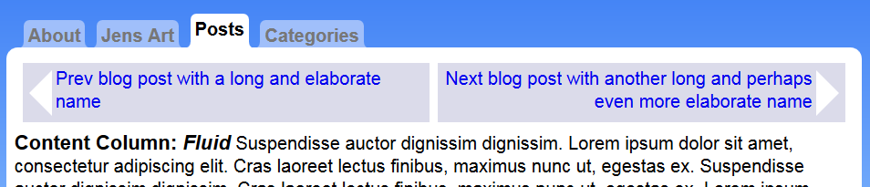
So this looks really nice already. The mechanics is okay but there is one thing I am not happy with. I would like the navigation table to line up exactly to the text.
Right now the navigation table is inset compared to the text. This is because of the border spacing 7px. The border spacing is between cells but also on the outer edge of the table. When I set border spacing to 0 then the table will look like it is lined up to the text.
I still want the space between the previous and next. Another way to do this is by inserting a border inside the cells. A border of the same color as the background. That will do for now.
.nav td:first-child≺br /≻{≺br /≻ border-right:3.5px solid #fff;≺br /≻}≺br /≻≺br /≻.nav td:last-child≺br /≻{≺br /≻ border-left:3.5px solid #fff;≺br /≻}
I want the fake border to be exact as wide as the margin so can you 7 by half and make each side 3 and a half pixels wide? Yes you can!
Hereby I am happily finished with the layout for now.
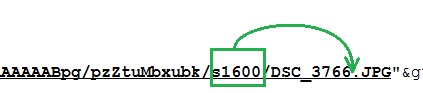
When blogging about this feature of the layout I started making screenshots and pasting the images directly into the blog editor. At some point I could not save the post. Then I figured out that the BlogEngine.NET editor converts a pasted image into a base64 encoded string inside the htm content. With a post like this with 10 images this is a lot of data. BlogEngine.NET could not handle that but it was darn convenient.
This means I have yet another method of storing images in BlogEngine.NET that I need to detect when I am porting the blog. I will come back to pasted images when it is time to do the final conversion.
For now I am done with the layout. Now I can start working on loading the data from the database and present it in this layout. But that is for next time.

 Sounds in the blogsystemNext version of the slideshowLearning Python Part IIILearning Python Part IIImpressionism and beyond. A Wonderful Journey 28 January 2018Fixing unresolved links after editingThis is my summer 2016 blog!Porting my blog for the second time, linksPorting my blog for the second time, editing part 7Porting my blog for the second time, editing part 6Porting my blog for the second time, categories part 3Business cards, version 1Porting my blog for the second time, deployment part 2Not indexed but still missing? Google hypocrisy.A new era: Nikon D5100 DSLR, Nikkor 18 - 55 and 55 - 300!
 I moved from Sweden to The Netherlands in 1995.
Here on this site, you find my creations because that is what I do. I create.